|
Charting The New York Times' Narrative, Part Three [Updated]Chris MenahanInformationLiberation May. 31, 2019 |
Popular 
Trump Expected to Pick Kevin Warsh, Son-in-Law of Zionist Billionaire Ron Lauder, as Fed Chair

IDF Soldier Takes Sledgehammer to Jesus Statue During Operations in Lebanon

Mark Levin and Jonathan Pollard Push for Nuking Iran

Trump Says U.S. Sent 'A Lot of Guns' to Iranian 'Protesters'

US and Iran Agree to Two-Week Ceasefire
  Principal Lecturer David Rozado of Otago Polytechnic in New Zealand released data on Thursday from his own project charting the New York Times' narratives over the past five decades. Principal Lecturer David Rozado of Otago Polytechnic in New Zealand released data on Thursday from his own project charting the New York Times' narratives over the past five decades. "A few months ago I scraped all the articles from the New York Times since 1970. I set up a website for anyone to research word frequency usage over time. It's handy for people who cannot afford a license from LexisNexis," Rozado said, linking to his website. 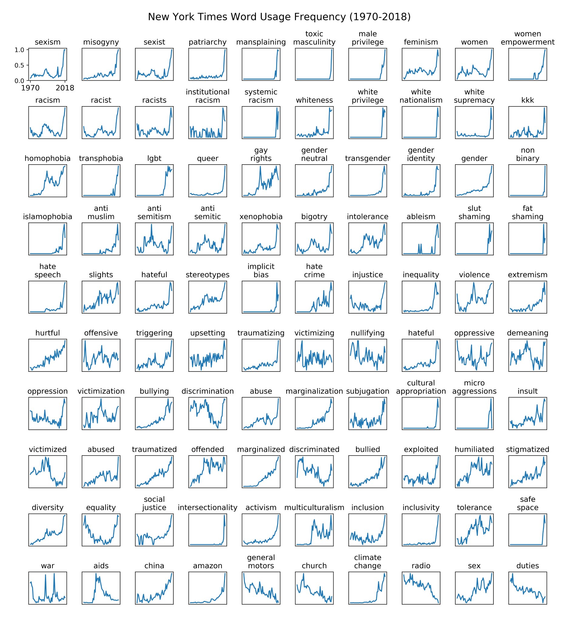 Rozado shared his charts in response to Zach Goldberg sharing similar research earlier in the week.
UPDATE: Rozado released more charts on Saturday: 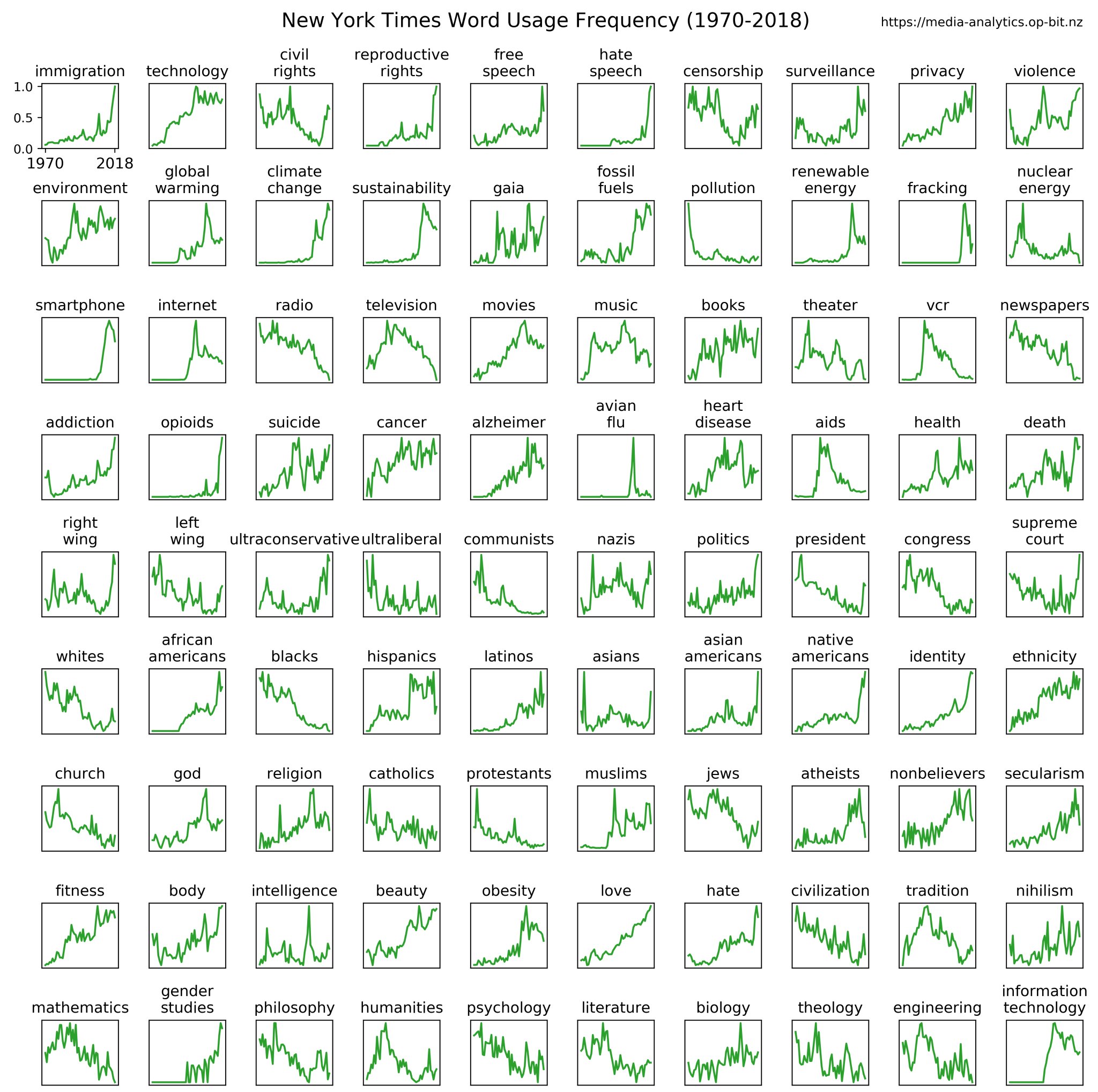 I just can't get enough of these charts. This one may be the best yet. These narratives were manufactured from the top down and pushed on society through constant repetition. The break out years for this leftist lunacy was 2013-2014. Some major events which happened in 2013 were: - Obama starting his second term - SCOTUS striking down The Defense of Marriage Act - Paula Deen losing her job for admitting during a deposition that she used the n-word at some point in her life - Pope Francis elected - Tinder taking off 2014: - Ferguson riots after the Michael Brown shooting - Rise of ISIS - Ebola - GOP sweeping the midterms - Russia taking Crimea It's not clear what changed but Steve Sailer has been speculating about it for a while now. These phony narratives are what caused the country to become so wildly divided (after some 40 years of mass immigration, of course). 
Follow InformationLiberation on Twitter, Facebook, Gab and Minds. |