|
Charting The New York Times' Narrative [Updated & Expanded]Chris MenahanInformationLiberation May. 29, 2019 |
Popular 
Vice President JD Vance Reacts to InfoLib Clip of John Podhoretz Melting Down Over Iran Deal

Mark Levin, Ben Shapiro Throw a Fit Over Trump Announcing Iran Deal

Israel Lobby Seeking to Revamp U.S. Aid as 'Partnership' Immune to Political Shifts

U.S. Must Prep to 'Welcome Large Numbers of Jewish Refugees,' Pro-War Lobbyist Mark Dubowitz Says

Israel Lobby Ousts Thomas Massie From Congress in Most Expensive Primary Race in History
  Georgia State University PhD student of Political Science, Zach Goldberg, searched through LexisNexis archives of the New York Times to perform a deep dive into how they've shaped the narrative by using terms like "whiteness," "white privilege," "implicit bias" and "diversity and inclusion" in their articles. Georgia State University PhD student of Political Science, Zach Goldberg, searched through LexisNexis archives of the New York Times to perform a deep dive into how they've shaped the narrative by using terms like "whiteness," "white privilege," "implicit bias" and "diversity and inclusion" in their articles. He shared his findings Tuesday in a long thread on Twitter:  Note, the privilege graph had to be corrected due to a coding error:
This data isn't perfect as it doesn't adjust for number of articles written and chart the usage as a percentage of all articles but it's still quite revealing. The New York Times' old "Chronicle" feature produced very solid charts showing what percentage of their articles included various terms. It produced charts such as this: 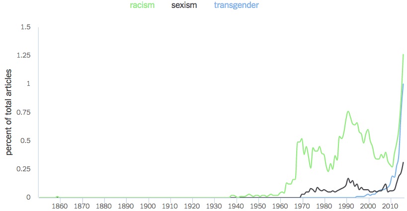 The Times pulled the feature shortly after it was released. Blogger Audacious Epigone shared another revealing chart last week showing the types of prejudices the New York Times' concerns itself with.  To quote Malcolm X: "The media's the most powerful entity on earth. They have the power to make the innocent guilty and to make the guilty innocent, and that's power. Because they control the minds of the masses." The media is currently lashing out and demanding mass censorship because their fake narrative is collapsing. UPDATE: Goldberg released new charts using percentages which make clear these results are not merely due to the New York Times increasing their output of articles.   Here's that "safe space" chart: 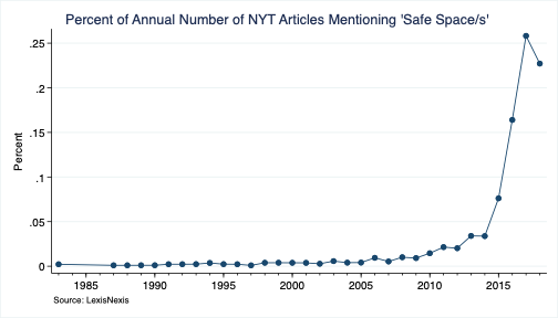 Follow InformationLiberation on Twitter, Facebook, Gab and Minds. |