|
The New York Times' Narrative, Mapped OutChris MenahanInformationLiberation May. 22, 2019 |
Popular 
Vice President JD Vance Reacts to InfoLib Clip of John Podhoretz Melting Down Over Iran Deal

Mark Levin, Ben Shapiro Throw a Fit Over Trump Announcing Iran Deal

Israel Lobby Seeking to Revamp U.S. Aid as 'Partnership' Immune to Political Shifts

U.S. Must Prep to 'Welcome Large Numbers of Jewish Refugees,' Pro-War Lobbyist Mark Dubowitz Says

Israel Lobby Ousts Thomas Massie From Congress in Most Expensive Primary Race in History
  The New York Times' narrative becomes quite clear when you compile a chart showing how many articles they've written over the past decade containing various prejudice-related terms. The New York Times' narrative becomes quite clear when you compile a chart showing how many articles they've written over the past decade containing various prejudice-related terms.Blogger Audacious Epigone shared the above chart over the weekend. The New York Times used to have a feature called "Chronicle," which mapped out what percentage of Times articles included specific words over the years, just as in the chart above. It produced charts such as this: 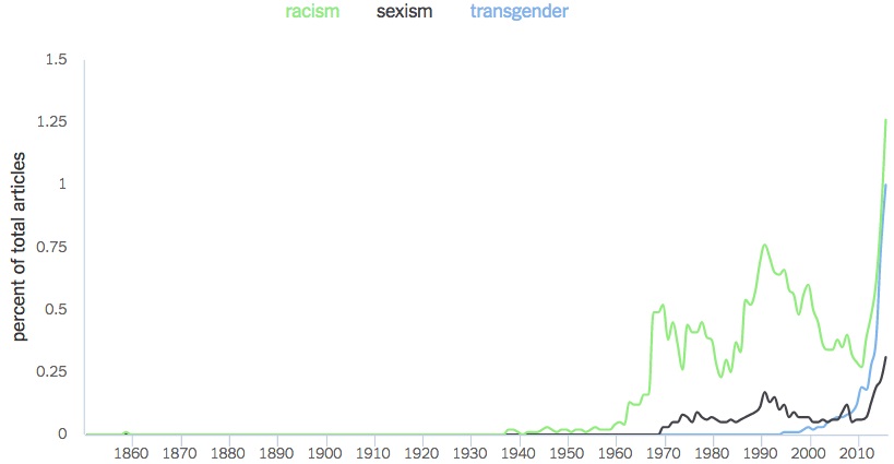 The Times pulled the feature shortly after it was released. Follow InformationLiberation on Twitter, Facebook, Gab and Minds. |