|
The New York Times' Narrative, Mapped OutChris MenahanInformationLiberation May. 22, 2019 |
Popular 
Trump Confronts South African President on White Genocide

Trump, After Rearming Israel, 'Frustrated' With Netanyahu for Expanding War

CNN: U.S. Officials Say Israel Preparing Possible Strike on Iran

Israeli PM Netanyahu: Trump Told Me 'I Have Absolute Commitment to You'

U.S. Official Denies Report Trump Team Told Israel 'We Will Abandon You' If You Don't End Gaza War
  The New York Times' narrative becomes quite clear when you compile a chart showing how many articles they've written over the past decade containing various prejudice-related terms. The New York Times' narrative becomes quite clear when you compile a chart showing how many articles they've written over the past decade containing various prejudice-related terms.Blogger Audacious Epigone shared the above chart over the weekend. The New York Times used to have a feature called "Chronicle," which mapped out what percentage of Times articles included specific words over the years, just as in the chart above. It produced charts such as this: 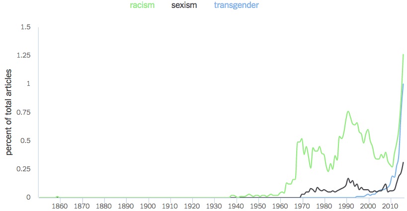 The Times pulled the feature shortly after it was released. Follow InformationLiberation on Twitter, Facebook, Gab and Minds. |