|
How Mathematics Can Make Smart People Dumbby Ben O'NeillJul. 01, 2011 |
Popular 
Sen. Graham Worked With Israeli Officials to Push GOP Senators to Pass Aid Package, Amb. Reveals

Netanyahu Confirms Plan to 'Merge' U.S. and Israeli Militaries

Mark Levin Flying to Israel as Netanyahu Reportedly Seeks to 'Leverage' Levin to Trash Trump's Iran Deal

Israel Told Trump of 'Iranian Assassination Plot' Before He Declared MoU 'Over,' Report Suggests

Sen. Lindsey Graham Dead at 71
  Mathematics can sometimes make smart people dumb. Let me explain what I mean by this. I don't mean that it is dumb not to be good at mathematics. After all, mathematics is a highly abstract and challenging discipline requiring many years (decades even) of study, and there are plenty of very smart people who have little understanding of it, and little ability to use it. What I mean is that mathematics quite often bamboozles people into accepting very silly arguments — arguments that are so silly that if you stated them without draping them in mathematical negligee, you would instantly become an object of ridicule to all those people who flunked out at basic algebra back in high school. Mathematics can sometimes make smart people dumb. Let me explain what I mean by this. I don't mean that it is dumb not to be good at mathematics. After all, mathematics is a highly abstract and challenging discipline requiring many years (decades even) of study, and there are plenty of very smart people who have little understanding of it, and little ability to use it. What I mean is that mathematics quite often bamboozles people into accepting very silly arguments — arguments that are so silly that if you stated them without draping them in mathematical negligee, you would instantly become an object of ridicule to all those people who flunked out at basic algebra back in high school. The danger of mathematical arguments is that a person can sometimes follow an absurd path of reasoning without being alerted to its absurdity, due to the fact that their mind is so lost in the verbiage of mathematical equations that their common sense fails to penetrate it. As a statistics teacher, I have to guard against this problem constantly in my students.[1] One of the main difficulties in teaching applied mathematics is that students can become bamboozled by the mathematical machinery they are using, to the detriment of their ability to reason sensibly about the nature of the problem that the mathematics is designed to describe. One of the most common errors in applied mathematical analysis is to fail to notice when a mathematical argument proves too much. This occurs when the same argument can be deployed more generally than in the particular case being considered, and in other cases where it can be deployed it leads to conclusions that are clearly absurd.[2] Though this can occur more generally — in nonmathematical reasoning — it is a particularly acute danger in applied mathematics, due to the fact that understanding mathematical arguments generally requires a high level of training and intellectual effort. It is very easy to get lost in equations and theorems and fail to see the forest for the trees. An Example of Applied Mathematics Going Horribly Wrong Let me give you an example of this phenomenon in action. The Australian government recently announced that it will attempt to enact legislation to impose a tax on industrial carbon-dioxide emissions, with some of the revenue being earmarked as compensation for affected consumers. At a pro-government political rally in Sydney, a young activist proudly displayed what he clearly thought to be a devastating economic argument in favor of this "carbon-pricing" scheme. See for yourself: 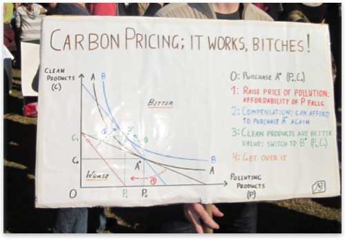 The "Say Yes" rally to support a proposed carbon-dioxide-emissions tax (June 5, 2011, Sydney, Australia)[3] To those readers who have not studied neoclassical microeconomics, this is probably just a big bunch of gibberish. But to those who have, it should look quite familiar. The graph is a "utility analysis," which purports to show that imposing a tax on polluting products (which increases their price) and simultaneously giving compensation back to consumers would make them better off than they were initially — in other words, it purports to show that the Australian government's proposed scheme, or something like it, would make people better off. This is a classic example of a mathematical analysis that proves too much. Notice, in the graph in the sign, that the two products are labeled "C" (for clean products) and "P" (for polluting products). Although they are labeled in this way, the fact that the horizontal axis represents the consumption of polluting products plays absolutely no part in the analysis. There is nothing in the graph representing the pollution that these products cause, and so the label is merely a name. The letter "P" is nothing more than an algebraic symbol, one that could just as easily stand for pies, pastries, printers, pizzas, polka lessons, picture frames, pole dancing, ponies, popcorn, pool tables, poppy-seed muffins, pornography, postcards, potatoes, potpourri, poultry, pumpkins, puppies, pudding, or any other good or service (including goods and services that don't start with the letter "P"). Thus, by the exact same mathematical argument, the graph implicitly purports to show that a government can make people better off by taxing any good and then compensating the consumers of that good. Though the government taxes the polluting products in the graph, the sign maker could just as easily have switched the labels on the axes so that the government taxes the clean products, and the result, according to the same analysis, would still be a consumer who is better off. In fact, the analysis in the graph could be taken further than this. Why stop taxing there? Repeating the same analysis, the government could increase the happiness of their subject population further still by imposing a tax-and-compensation scheme on the polluting goods, and then the clean goods. But why even stop there? They could then impose another tax-and-compensation scheme on the polluting goods, then on the clean goods, then on the polluting goods, and so on. Each time, the same analysis would purport to show that the consumer would become better off. In fact, the analysis could be repeated ad infinitum, allowing the government to completely transcend the problem of scarcity by boundlessly increasing the possible consumptions sets of the consumer.[4] How wonderful! But wait a minute. You don't need to be a mathematician, or an economist, to figure out that there is something funny going on here. Either some step in the analysis or some starting assumption must be faulty. In a moment I will explain what this is, but really, this exercise is largely academic. The point here is that the conclusion from the analysis is so absurd that something in the analysis must obviously be wrong, even if we are unable to pinpoint exactly what it is. It proves far too much. Suppose that this young fellow had eschewed mathematical explanation in this instance, and instead simply stated his argument verbally: "If you have two types of goods (let's call them C and P) and the government taxes one of those goods (say, good P) and then pays consumers of that good compensation, then those consumers will be better off than they were to start with." A question would immediately spring to the listener's mind: How much compensation is needed for this to happen? And in particular, is the revenue from the tax enough to cover it? Isn't this important in deciding whether this argument is a valid reason to support the tax? In verbal form, these questions would present a serious challenge to the analyst, and an opportunity for him to discover a serious flaw in his assumptions. The Error with This Analysis In fact, these questions are the key to the flaw in the analysis. Notice that in the second step listed on the sign, the consumer is given compensation that allows him to afford the same bundle of goods that he initially started with. Since the price of the polluting products has increased, this means that the cost of the compensation being paid in the analysis is equal to the amount of polluting products initially being consumed, multiplied by the increase in price from the tax. (In mathematical parlance, this is t × P0, where 0 < t < 1 is the price increase due to the tax.) Can the government afford this, using the revenue it extracts indirectly from these consumers? Well, let's start by being as generous as we possibly can to the argument, by invoking some fanciful assumptions in its favor. Let's assume — contrary to every sensible understanding of government — that the tax-and-compensation scheme can be enacted and administered without any costs at all. In this case, the net revenue taken from the consumers would be equal to the gross takings, which is equal to the amount of polluting products being consumed after the imposition of the tax, multiplied by the increase in price. (In mathematical parlance, this is t × P1, where 0 < t < 1 is the price increase due to the tax.) See a problem? The gross revenue taken from consumers uses the actual consumption level after the imposition of the tax, but the compensation payment given to consumers is based on the amount of revenue that would have been raised based on the consumption of polluting products before the imposition of the tax. Since the analysis shows that the consumer is consuming less of the polluting products after the imposition of the tax than before, this means that the revenue taken from consumers cannot possibly cover the compensation payments being made. (Since P0 > P1 we have t × P0 > t × P1.) In fact, using the exact kind of mathematical model being used in the sign, it can actually be shown that the amount of compensation required to fully compensate a consumer for a price rise (called the "compensating variation"), just to make them as well off as they started, is larger than the gross revenue extracted from the price rise.[5] That is, there is always some loss in consumer "utility" in this kind of scheme, even if we ignore any administrative costs to impose and run it, and devote the entire gross revenue from the price increase to compensation. Thus, the only possible argument that could be made along these lines is that giving consumers more money than they are paying in and shifting these excess costs onto others (e.g., producers) could potentially make them better off. But even then, an honest economic analysis of this situation would also need to look at the costs to others from this scheme, rather than obscuring the loss of revenue. Obviously, the situation becomes much worse if we make more realistic assumptions about the administrative costs of the scheme, since this reduces the net revenue available for payment as compensation. In reality, a taxation scheme of this kind would require very large amounts of money for the government to create and administer, and would also impose compliance costs on the taxpayers. The situation also becomes worse for the consumer if he receives only part of the tax revenue in compensation, rather than the full amount. There would also be disparities in the compensation between consumers, so that some would be worse off, even if others got a large amount. Possible rent-seeking behavior and other economic issues could make the situation worse still, until a very grim picture of the scheme starts to emerge. In the sign in the picture, the compensation required to get to the blue utility curve (making the consumer better off) would cost more than the gross revenue from the tax. In fact, even the compensation required to get back up to the black utility curve (making the consumer as well off as they were before the tax) would cost more than the gross revenue from the tax. Add administration costs for the scheme to this, and other realistic issues, and now you need to come up with an awful lot of extra money that is nowhere to be seen. In fact, regardless of the findings of a utility analysis of this kind, there is one overriding economic argument against a coercive scheme such as the one being proposed. If it were possible to increase consumer satisfaction by taking people's money and then giving it back to them in a revenue-neutral fashion in this way, then presumably consumers would be able to do this themselves — they could make voluntarily contractual arrangements for a scheme like this without any coercion being applied. The fact that they do not, and that they need to be coerced into compliance, demonstrates, by virtue of the principle of revealed preference, that they are not better off under such an arrangement, regardless of the purported findings of any economic models. Using Mathematics to Make the Dumbest Argument Possible If one were a supporter of a carbon-dioxide-emissions tax (I am not) then I doubt one would be too pleased with the above argument being presented in its favor if it were expressed in verbal form. Yet, add some mathematical bells and whistles to this absurdity, and you get a sign that was described by one sympathetic observer as the "Best Sign" at the rally.[6] In fact, not only is the analysis in the sign flawed, but when it is done properly, it actually leads to the exact opposite conclusion from the one asserted to be true; it alerts us to the fact that the tax-and-compensation scheme will leave the consumer worse off, unless they are given additional money, plucked like manna from heaven. Aside from the above instance where this argument is made in mathematical form, I do not recall ever hearing a single advocate of a carbon-dioxide-emissions tax make the asinine assertion that tax-and-compensation schemes of this kind would increase the happiness of consumers regardless of the good being taxed. They are not quite that silly. Almost all arguments in favor of taxation schemes of this kind are based on completely different reasoning from this, usually using "negative externality" arguments that assert actual pollution problems. These arguments cannot really be captured in a single consumer-utility graph, since they involve assertions of interactions between the actions of one consumer and the preferences of another. The mathematical argument presented in the picture above is therefore not an advancement of the pro-tax position. It actually does a serious disservice to this position by presenting an incorrect and very ill-considered justification for it. This shows the particular danger of getting bamboozled by applied mathematical analysis, to the extent that absurd premises slip through the net undetected. It allows a person to make the dumbest argument possible for a particular proposition, while maintaining a supreme measure of confidence, and indeed cockiness, in his own position. When doing applied mathematical analysis we need to be careful not to fall into this trap. Though mathematics is a specialized discipline, beyond the understanding of many people, a sound analysis in applied mathematics should generally be translatable into a sound verbal argument, at least in a heuristic form. Its arguments are progressions from premises to conclusions based on logic, and hence, if you cannot explain the structure of your argument and its premises (at least in heuristic terms) to people without much mathematical training, you probably do not have a broad enough understanding of the structure of the argument to warrant reliance on it. The Purpose and Value of Mathematical Arguments I have not shown this example simply to demonstrate the dangers of having inept economics students present their ham-fisted policy analysis in public. It is actually demonstrative of a wider point regarding the use and abuse of mathematical arguments: mathematics cannot do scientific problems for you. All that mathematics can do is to allow you to state problems in quantitative form and find the logical consequences of various assumptions about the problem you are trying to solve. A mathematical argument shows that certain premises lead logically to certain conclusions. But it does not guarantee that those premises bear any resemblance to reality. Whether or not they do is an important matter, deserving the utmost consideration. Mathematics is meant to augment logical argument, by providing the ability to clearly define a problem, and to ensure that all necessary assumptions are made explicit in the analysis. Its advantage over "literary" argumentative methods (when used properly) is that it ensures that the analyst is not making assumptions that he is unaware of, and is not making leaps in argument that are illogical. However, when mathematical arguments are used to obscure, rather than enlighten, the result is that they tend to hide assumptions that are being made. The argument presented in the sign above hinges on the fact that it hides any discussion of the amount of revenue needed for the compensation payment that is assumed to be made. It does not compare this amount to the actual amount of revenue taken from consumers due to the price rise, and as soon as this issue is considered, we see that the argument presented in the sign is either wrong or at the very least highly misleading. Actually, the real purpose of the sign above is not to convince but to obscure. The purpose is to prevent rational debate on the subject by warding off the approaches of anyone who has not studied mathematical economics and is unable to penetrate the meanings of the various lines on the graph. Like so many purported scientific justifications of government power and intervention, the argument in the sign needn't be remotely sensible so long as it is arcane enough to keep the riffraff from understanding the argument that is being made — and the premises of that argument. It is an appeal to authority, with the authority in this case being a bunch of fancy graphical work. Like so many purported scientific justifications of government power, it is based on false premises and/or shoddy logic, masquerading as bona fide scientific analysis. It is the voice of a pretentious elite saying, We couldn't possibly explain our reasoning to you in a way that you could understand, so just defer to our clearly superior intelligence, bitches. (Note: mathematics can sometimes make smart people dumb, but it cannot make them pretentious mediocrities; they do that on their own.) When mathematical arguments prove too much, it is often as a result of faulty assumptions. If an applied mathematical argument leads to a conclusion that is highly counterintuitive, or if the form of argument can be deployed just as effectively to prove other conclusions that are highly counterintuitive, then this is good reason to further scrutinize the assumptions made in the argument. Mathematics is a fascinating and powerful discipline, and one that I love a great deal. Enjoy it to the extent that you are able. But, as Ayn Rand used to say, check your premises! __ Ben O'Neill is a lecturer in statistics at the University of New South Wales (ADFA) in Canberra, Australia. He has formerly practiced as a lawyer and as a political adviser in Canberra. He is a Templeton Fellow at the Independent Institute, where he won first prize in the 2009 Sir John Templeton Fellowship essay contest. Send him mail. See Ben O'Neill's article archives. Notes [1] In my own teaching, I like to keep students on their toes by occasionally presenting them with a flawed statistical argument that leads to a conclusion that is quite obviously absurd. My favorite practice is to give them statistical questions that invite them to conflate correlation and cause — leading to some obviously absurd conclusions — and then see if they notice the absurdity of the conclusion they are getting, rather than plowing ahead blindly with their equations. [2] A warning against acceptance of this kind of argument is captured in the Latin maxim, quod nimis probat, nihil probat, which means, "What proves too much proves nothing." [3] Picture taken from http://twitpic.com/57awlj. I have cropped out the young man's face, since it is not my intention to embarrass him. Scrutiny of his sign is mainly for the purposes of showing a more general problem pertaining to attempts at applied mathematical analysis, though it is certainly worthy of criticism, especially for its rude and pretentious demeanor. [4] Assuming that the utility function in the analysis is strictly quasi-concave (a common assumption in neoclassical microeconomic analysis), infinite repetition of the scheme in the graph would lead to an infinite series of strictly positive utility changes. Some further assumptions about the utility function would then be needed to ensure that this series diverges to infinity, so that utility (and the budget constraint and consumptions sets) can be boundlessly increased. In particular, a homothetic utility function is a sufficient but not necessary condition for this result. [5] For a demonstration of this, using standard neoclassical utility analysis (as is used in the sign), see Example 3.I.1 of Mas-Colell, A., Whinston, M.D. and Green, J.R. (1995) Microeconomic Theory. Oxford University Press: New York, pp. 84-85. Discussion of the same kind of example can be found in Jehle, G.A. and Reny, P.J. (2001) Advanced Microeconomic Theory (2nd Edition). Addison-Wesley Longman: Boston. pp. 53, 166–171. Such an analysis uses standard neoclassical microeconomic assumptions; it assumes that the preference relation of the consumer is complete, transitive, continuous, strictly monotonic, and strictly convex (the last two assumptions ensure a strict loss of revenue to the government, but these can be relaxed to still yield a nonstrict loss). [6] See picture caption at http://twitpic.com/57awlj |